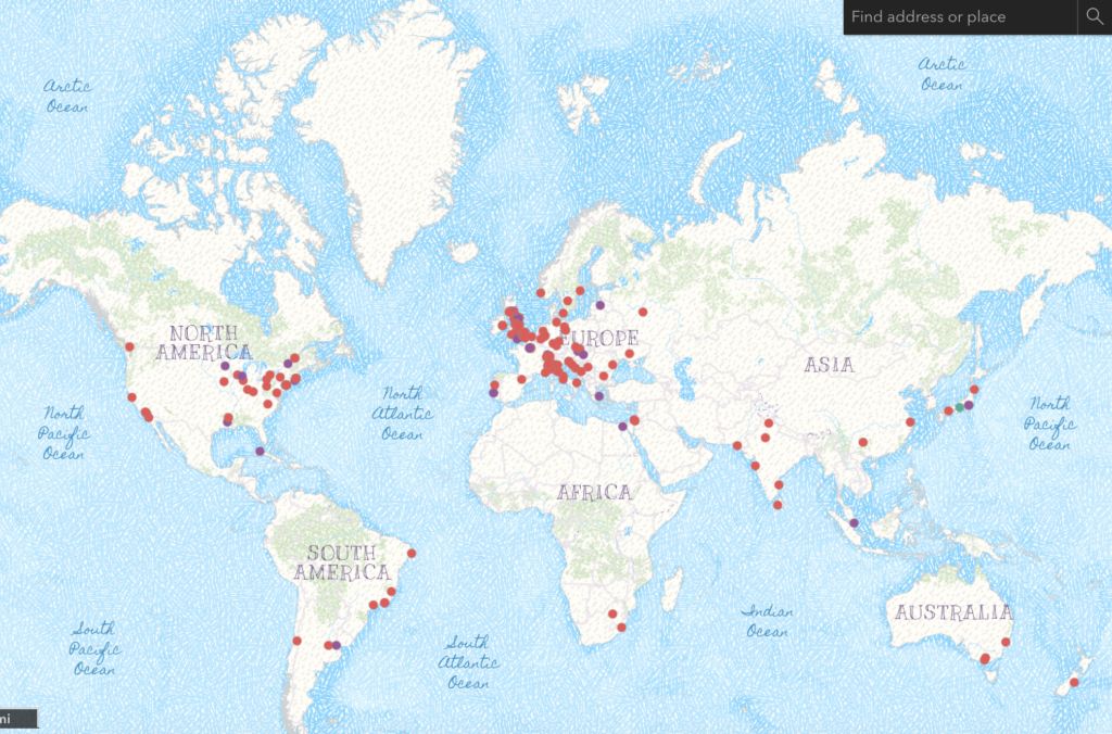
For my midterm project, I created a visualization of the geographical distribution of the Tate Museum’s artists. The user can click on individual artists and is provided with their name, place of birth, years lived, and a link to their page on the Tate website. I wanted to acknowledge the diverse array of artists whose work is displayed in the museum and allow users to recognize geographical patterns amongst artists.
For this project, I used the Tate Museum artist data CSV, which contains information about their place of birth, year of birth and name as well as a link to their information on the Tate website First, I deleted the id column as it felt unnecessary. To map the geographical distribution of artists, I used their city of birth. However, several of the data set entries did not specify a city of birth. In addition, when I imported the entire CSV into ArcGIS, using each artist’s city of birth for location, the software assumed many English cities were located in America, as many cities in the US and UK have the same name. I decided to delete any British cities that were causing this problem as well as entries without a city of birth from the data set. In the end, cleaning proved time-consuming so I only kept 175 data set entries.
I wanted to highlight gender and geographical distribution so I decided to use ArcGIS to map out the location of different artists’ places of birth. To diverge from traditional gender color stereotypes I represented female artists with the color purple and male artists with the color red. I also changed the default map background for aesthetic purposes.
Although my final product does provide a representation of the geographical and gender distribution of Tate artists, because I compressed the data set, it is not entirely accurate. I purposefully included many international artists in my data visualization to have more dispersion on the map. Therefore, this visualization cannot be used to analyze general patterns of geography amongst Tate artists. More specifically, many of the artists who live in England are not represented because the place where they were born is comprehended as an American city by ArcGIS. If I were to make this project more accurate I would find the coordinates for each artist’s place of birth and use that to map their geographical distribution instead. However, I think this visualization helps bring attention to the gender disparity in the art field, encouraging museums to actively seek out female artists to add to their collections.
In general, I think that mapping is a helpful tool to analyze spatial patterns. It allowed me to analyze two patterns in the data set, gender and geography. Overall, mapping gives users the ability to analyze multiple facets of complex data at the same time. This project helps bring to light the significance of diverse artists in both gender and ethnicity rather than just being a map with geographical coordinates. In this way it is a digital humanities project rather than a data science project.
The embed feature was not working so here is the link to my map: https://arcg.is/14jqSO